Smart Builder
Our user-friendly drag&drop tool makes it easy to create professional responsive e-mails, newsletters, e-invitations, confirmation messages and follow-ups mails. All aimed to stand out and generate maximum response in any inbox, on any device.
Workflows
Schedule the perfect post-event follow-up? Or instantly feed your sales team with the hottest leads? EmailGarage+ Workflows helps you draw out a fully automated scenario that ties in seamlessly with your best strategy.
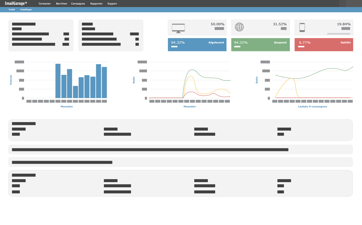
Reporting & Web Tracking
Optimizing your e-marketing starts with a sound understanding of the marketing data that’s on hand. The EmailGarage+ platform and Web Tracking will provide you with integrated data that spans across your database, email marketing and website traffic.
Survey Module
Create detailed, elaborate surveys and build smart scenarios based on the answering options. Thanks to the marketing automation you will effortlessly set up the perfect follow-up flow, including reminders.
Contact Database Manager
Customize your contact information with your own fields and use them to personalize your e-mail messages or to further segment your contact database.
Preference Center
Tune up your opt-in form with specific contact preferences and offer your contacts the possibility to indicate which information they would like to receive from you.
-

Thanks to EmailGarage+ press, media and other important contacts now get our concert and festival scoops in their inbox faster than ever.
Nele Bigaré
PRESS & COMMUNICATIONS MANAGER - LIVE NATION
-

EmailGarage+ perfectly answers our need for specific email designs suited to every type of communication we send out: newsletters, commercial emails, general notices,... The flexibility of the professional templates is amazing, every one of our demands has been met!
Ilse Hens
MARKETING - PARTENA
-

This intuitive web tool enables us to get our emails to our recipients fast, flawlessly and beautifully designed. It has become an indispensable tool in our conversation with prospects, customers and suppliers.
Thomas Vanautgaerden
MARKETING COMMUNICATIONS MANAGER – CONTINENTAL
-

Being software developers ourselves, usability is high on our priority list. When we test-ran EmailGarage+ for the first time, we succeeded in designing and sending out a professional looking email in no time. That’s what we call user-friendly: plain and simple
Alex Dossche
Managing Director - Sage Belgium
The only full-service partner you’ll ever need
Need a full-service partner? Or prefer to put together your own service package? Everything´s possible. Simply use us where you need us.
Are you ready to take your email marketing to the next level?
Learn moreStrategy and advice
Content planning
Copywriting
Design and HTML
Reporting and analysis
Campaign management
Email marketing automation
Email marketing technology